
Wednesday, 28 January 2015
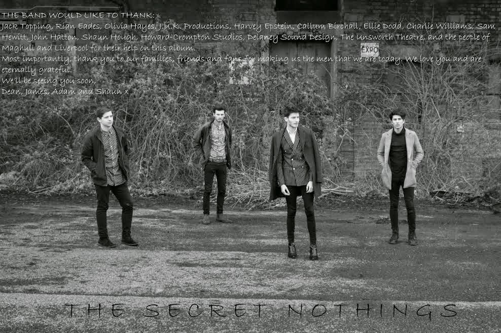
Digipak Back Cover
Tuesday, 27 January 2015
Group Pictures for my Digipak
Here are the remaining pictures for my Digipak - featuring all band members together as a group. The pictures were taken in locations around our home town of Liverpool, accompanied by my group members Rian and Olivia. The pictures have been edited in PhotoShop to take a lot of the grime and dirt in our shots out, however, I have left a little unedited as I feel that it mirrors the rough-edged image that we want our band to have. In my research, I was inspired by band shots of The Wombats and The 1975 in things such as band formation, stance and setting. However, I believe that the clothing our band wears in the shots taken are both reflective of the indie genre whilst also seeming incredibly different from any other band out there, making our fake band stand out from others. The colour scheme is, like the rest of my digipak, black and white to
reflect the mood and tone of both our band and the music that they play. The 'thank you' page that I have created is more rectangular than the others as it is meant to take up two pages as opposed to the one that every other picture that I have created would have.


Below are some band images of The Wombats and The 1975 that I was inspired by:


Below are some band images of The Wombats and The 1975 that I was inspired by:
Monday, 26 January 2015
Individual Band Pictures for my Digipak
Here are a selction of the pages meant to accompany the lyric pages in my digipak. The pictures were taken during a real gig that our band was playing and were edited in PhotoShop to increase the quality to make my digipak the best that it could possibly be. I was inspired to incorporate individual band member shots into my digipak by the digipaks of artists such as Fall Out Boy ('Infinity on High') and Blur ('The Best Of'). However, in my research I found it very rare that band members would actually be playing their musical instruments - so I incorporated each band member performing in each picture to further the ideology that the band are both a real band and a band that stands out from the rest. The colour scheme is, like the rest of my digipak, black and white to reflect the mood and tone of both our band and the music that they play.


Sunday, 25 January 2015
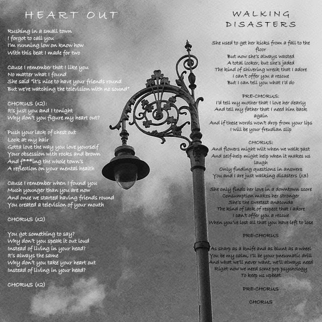
Lyric Pages for my Digipak
Using PhotoShop and with a range of pictures that I have taken myself, I have created 6 pages for my digipak containing the lyrics for each song that I have stated will appear on our band's album. In a previous blog post, I said that the songs that would be featured are:
01. Heart Out - The 1975
02. Walking Disasters - The Wombats
03. Sweater Weather - The Neighbourhood
04. Handshake - Two Door Cinema Club
05. Tiny Legs - Then Thickens
06. Pressure - The 1975
07. Dead American Writers - Tired Pony
08. Rain - The Luka State
09. When It Rains - Paramore
10. The Wolves (Act 1 & 2) - Bon Iver
11. Tiptoe - Imagine Dragons
12. Avocado, Baby - Los Campesinos!
These are the lyric pages that I have created:


The colour pallette that I have chosen for these pages is purely black and white. The reason for this is that we have already established that our band's colour scheme is mainly black and white to represent the dark tone of their music, as well as themes such as sorrow and angst found throughout our music choices and imagery. I feel that the way that I have styled these pages very much so reflects these themes.
Additionally, I have tried to structure the place of the lyrics in places that are still able to show the nature of the pictures that I have taken - different environments that I believe our band would take inspiration for their songs from (Albert Dock, a street, a beach, street lights on the motorway and above the clouds). I believe that I have successfully conveyed this.
Below are the original versions of the pictures below:


01. Heart Out - The 1975
02. Walking Disasters - The Wombats
03. Sweater Weather - The Neighbourhood
04. Handshake - Two Door Cinema Club
05. Tiny Legs - Then Thickens
06. Pressure - The 1975
07. Dead American Writers - Tired Pony
08. Rain - The Luka State
09. When It Rains - Paramore
10. The Wolves (Act 1 & 2) - Bon Iver
11. Tiptoe - Imagine Dragons
12. Avocado, Baby - Los Campesinos!
These are the lyric pages that I have created:


Additionally, I have tried to structure the place of the lyrics in places that are still able to show the nature of the pictures that I have taken - different environments that I believe our band would take inspiration for their songs from (Albert Dock, a street, a beach, street lights on the motorway and above the clouds). I believe that I have successfully conveyed this.
Below are the original versions of the pictures below:
Friday, 23 January 2015
Final Album Cover for my Digipak
After stating in my most recent blog post that I would be using the album cover known as 'SYMMETRICAL' as the feedback for that cover was the most positive - with many stating that it looked the most like a professional album cover due to factors such as aesthetic, colour and camera angling. However, I stated that I would change the name of the cover as I felt that the title 'SYMMETRICAL' didn't go with the cover at all. Since then, I have re-edited the album cover and given it the title 'YOUTH IN REVOLT'. The reason for this title is that I feel that the theme of youth rebellion is strikingly recognisable and influential across the indie genre and the target audience that we are after. Additionally, I feel that the title is a good representation of our band's image and the song choices that we have allowed to shape our album. As a result, here is the album cover for 'YOUTH IN REVOLT' by 'THE SECRET NOTHINGS'.


Tuesday, 20 January 2015
Final Choice of my Album Cover Image
Today, in order to choose a definite album cover for my digipak, I decided to seek the opinion of members of our genre's target audience to determine which cover was best. I asked three of my friends - Amber, Karolina and Siobhan - that are fans of the indie music genre which album cover they deemed their favourite. I was surprised to find that each had the same answer:


 All of them picked the second album cover - 'SYMMETRICAL' as their favourite, with Karolina saying it looked "majestic" and Amber saying that it was the one that she would "expect most to be an album cover" as it followed conventions such as aesthetic, camera angling and colour. As a result, this will be the album cover that I will be editing and eventually using for my digipak.

However, the name "SYMMETRICAL" will be changed in my update of the cover. I originally chose this name as it was in-keeping with usual names found in the indie genre and was meant to be a tongue-in-cheek joke, as the picture itself is near-symmetrical but not quite. However, I have become disillusioned and unimpressed with this name over the past few days as it is very easy, from an audience point-of-view, to not understand the title. As a result, I have decided to choose another name that I will reveal in my next blog post.
However, the name "SYMMETRICAL" will be changed in my update of the cover. I originally chose this name as it was in-keeping with usual names found in the indie genre and was meant to be a tongue-in-cheek joke, as the picture itself is near-symmetrical but not quite. However, I have become disillusioned and unimpressed with this name over the past few days as it is very easy, from an audience point-of-view, to not understand the title. As a result, I have decided to choose another name that I will reveal in my next blog post.
Sunday, 18 January 2015
Identifying Problems with our First Cut
Whilst the general praise for the first cut of our video has been overwhelmingly positive, with a lot of praise being heaped on to the performances, direction and camera work, we have found that some of our audience have had trouble understanding the whole narrative. We obviously want to make the best video that we can and believe that a small number of shots may be hindering the video's success. As a result, I have rewatched the first cut and identified the small amount of changes that need to be made within the narrative:
 This shot was originally written when the location that the male protagonist was running to was the room seen in the video, which we later changed in production to a bus stop for more dramatic effect. However, this shot appears to be the most confusing in the entire video, with the shot making audiences think that our female protagonist is dead or dying. As a result, we believe that the shot is out of place and unintentionally misguiding the audience and so we will not feature it in our final video.


These shots are included in the video to show that the female protagonist is cheating on the male protagonist with another man (played by myself). However, some people failed to realise that my character was a different character to Callum's, meaning that this side of the narrative is not recognised. As a result, we will reshoot these shots to make this narrative plot-point clearer to the audience.
 This shot is meant to show the two protagonists arguing, highlighting that their relationship has a negative side. However, we don't feel that this shot reflects the emotions we were after, so we will be reshooting this shot for our final video.
These shots are included in the video to show that the female protagonist is cheating on the male protagonist with another man (played by myself). However, some people failed to realise that my character was a different character to Callum's, meaning that this side of the narrative is not recognised. As a result, we will reshoot these shots to make this narrative plot-point clearer to the audience.
Saturday, 17 January 2015
Drafts of Potential Album Covers for Digipak
Using some of the digipak pictures that I took from Dublin, I have used PhotoShop to create potential album covers for my band's digipak. I edited the majority with the black and white filter, and used the 'Bradley Hand ITC' text to show the band's logo and album names. In choosing my album names, I decided to use names that related to each picture, as well as relating to the conventions of the indie genre. My research shows that the names that I picked represent the genre very well - ranging from city names (Pimlico Grit) to subtle jokes (Symmetrical).


Friday, 16 January 2015
Thursday, 15 January 2015
Digipak Pictures of the Band


Digipak Pictures from Dublin
I have decided to use a handful of pictures that I have taken from a recent trip to Dublin to use as part of my digipak, as well as the photographs that I have already taken of the members of our band "The Secret Nothings". The reason for this is that my research into digipak designs has shown that locations are often used to make the artists seem more exotic and interesting - with examples including the digipaks for The Script's debut album "The Script", Vampire Weekend's third album "Modern Vampires of the City", and Beyonce's self-titled fifth album. Additionally, I feel that these pictures visually fit in well with the style and aesthetic of the band and so, if I give the colour some tweaks, I can make my digipak flow very well.


Subscribe to:
Comments (Atom)